Everyone knew. Nobody knew how.
Years before I was involved, Zoro spun up a product team called Dispatch and tasked it with building a fully custom, ADA-compliant design system. It moved slowly. The leadership around it was thin, not much came out of it, and eventually the team was killed. Engineering's verdict at the time: why are we even doing this when we can just use Vuetify? It already exists and has all these components.
So Zoro has been on Vuetify for years. And Vuetify is fine, but it isn't a design system. What accumulated instead was ADA compliance issues and inconsistency across the whole experience. Badges that look different depending on who designed them. Link styles that vary by team. Three competing typescales. Not because anyone made bad decisions. Because there was never a system to make a decision once and apply it everywhere.
Everyone saw it. At least once a week, someone would say "this is why we need a design system." We all knew it needed fixing. Nobody knew how to make it happen.
Attempt two: KIT
In October 2025, the KIT team was created. Not a real team. A cohort of five designers, chosen as an odd number so no vote could tie, fitting design system work in around their actual jobs. It was led by the same two people who had led Dispatch.
Three months in, nothing had shipped. There was an intake form where designers could submit real questions, like "I need to add badges to product cards. What are the rules? Which colors are allowed, and what do they mean?" The questions came in. Answers didn't go out. In January, one member quit the cohort out of frustration.
My manager, Paul Radliff, filled the seat by adding me, with an express request: help them move faster.
It's a judgment call
My first meeting was an onboarding: here's what's happening, here's how we work. Someone raised the badge question. Good, I thought. A real request from a real designer. Let's answer it.
A week later, we met to talk about badges. Except we didn't. We talked about talking about badges. The hour ended with a proposal for another meeting and a Figjam board collecting every place we currently use badges, or might ever want to use them in the future. That's the process trap: every decision generates a prerequisite decision, the checklist grows, and nothing ships.
So I said no. It's a badge. We have five colors. Everyone in the room was a lead with at least eight years of experience and years at Zoro. We should know by now. I pushed for a vote, and we made the decision that day. Over the next two weeks, one designer redesigned the component in Figma, another updated the documentation in Confluence, we approved the final drafts, and the answer went out.
One good component shipped quickly is better than one perfect component in six months.
The same thing happened a few more times. A question would start growing a process around itself, I'd push for a vote, and we'd just decide. Not because I'm awesome or have the best ideas. Because I don't think every decision needs a gantt chart when experienced people can make a judgment call.


The honest middle
I'd like to tell you KIT built momentum from there and shipped its way to a design system. It didn't. A few forced votes solved a few real problems, but the format was the problem: a part-time cohort with no mandate, led by process, working around the edges of five people's real jobs. By spring, leadership was changing and KIT was paused.
I helped get some things done. Mostly, I helped prove the format couldn't get us there. Both of those turned out to matter.
Three attempts at a design system
~2022
Dispatch team forms. A real product team, tasked with a custom, ADA-compliant design system.
Attempt one
~2023
Dispatch killed. Engineering's verdict: "Why are we even doing this when we can just use Vuetify?"
2023–25
Years on Vuetify. ADA issues and inconsistency accumulate. Everyone sees it. Nobody owns it.
Oct 2025
KIT forms. Five designers fitting it in around their real jobs, led by the two people who led Dispatch.
Attempt two
Jan 2026
Three months, nothing shipped. One member quits. I'm added: "help them move faster."
+2 weeks
The badge question gets a forced vote, a decision, approved drafts, and an announcement.
First shipped decision
Spring '26
KIT stalls and pauses. Leadership changes.
Mid 2026
New Director of Digital Experience sees the Storybook: "Why can't we do this, but for a design system?" A 90-day tiger team forms.
Attempt three
2
Stalled attempts
1
With sponsorship, metrics, and a proven artifact
The turn
Around the time KIT paused, Zoro hired a new Director of Digital Experience. The role had been vacant for almost two years. And around that same time, Aaron and I were building our Storybook library: every component from the Figma design system, coded on the exact production stack, everything mapped to tokens. Building it had effectively required auditing both Figma and the production site.
The new director saw it and asked the question that started attempt three: "Why can't we do this, but for a design system?"
So now there's a 90-day tiger team, and this attempt looks different. Leadership sponsorship. Real scope: keep Vuetify or not, and either way, fix the ADA problems that come with it. Targeted metrics on component reuse and reducing net-new patterns. And the Storybook, which started as a two-person pet project, is becoming the documentation and governance layer for the entire system. When the tiger team's work is done, KIT gets reborn with a single clear job: maintain and govern the Kit.
What the project includes
Foundations
Tokens, type, spacing, color, elevation, and accessibility.
Reusable Assets
Priority components, patterns, templates, and flows.
Alignment
Figma, code, parity expectations, and implementation paths.
Documentation
Storybook, usage guidance, states, examples, and validation.
One Operating Model
Builder Coverage
Page modules, editable fields, constraints, and gaps.
AI Guardrails
Rules, recipes, prompts, QA checks, and agent context.
Governance
Intake, ownership, approval, contribution, and release.
Week one: 772 components
The tiger team's first question was the right one: what do we even have? Do we need all of it? What stays, what goes?
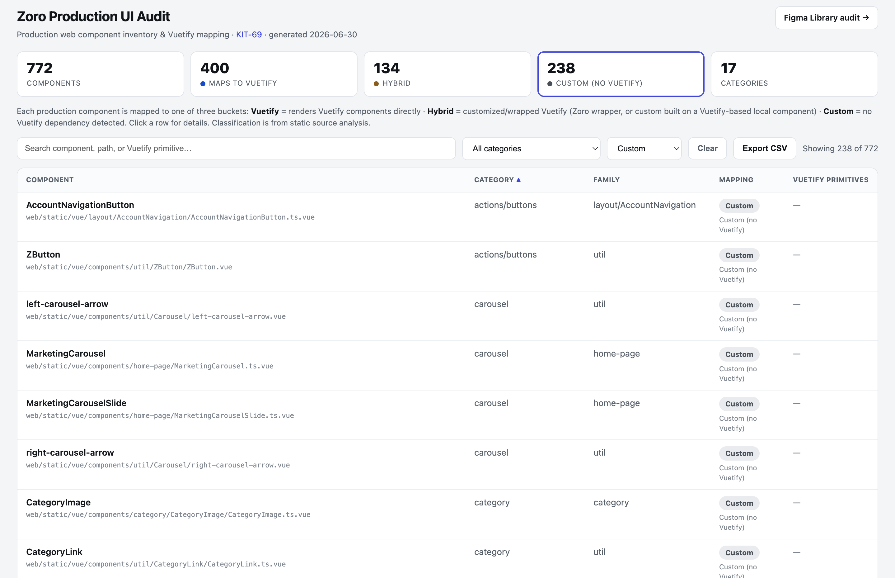
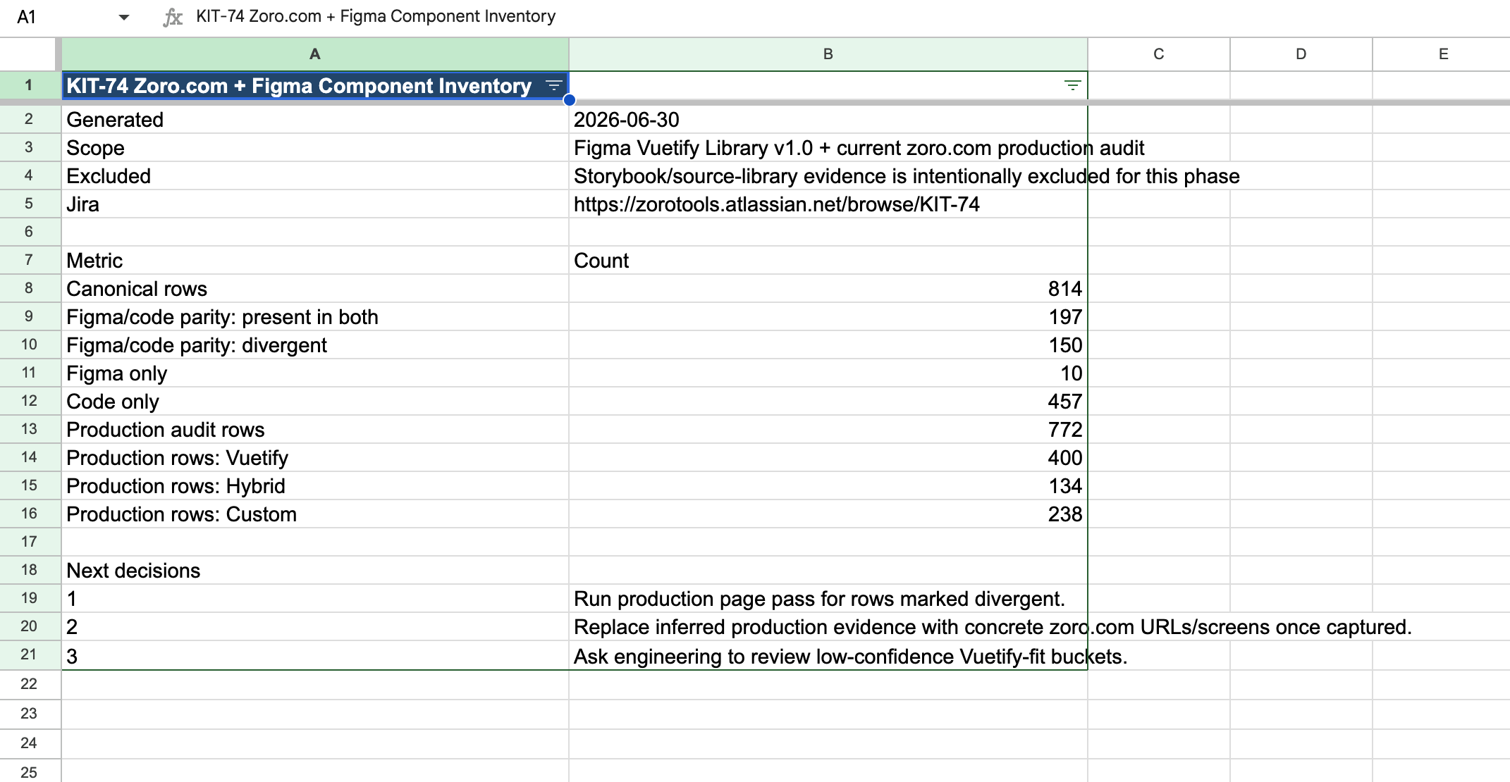
In the first week, I audited the entire production website and our entire Figma library, and built a dashboard to hold it all. And by "I audited," I mean I had Cursor run a full scan of the production codebase. 772 components. 156 duplicates. 400 that map directly to Vuetify, 134 hybrids wrapped around Vuetify, and 238 fully custom. Then the audit revealed the bigger number: 457 components existed only in code. Designers had been working from a Figma library that didn't account for more than half of what users actually see.
Then the method multiplied. I walked another designer through cloning the production codebase and having Cursor analyze every font size against our competing typescales, and showed her how to add the results to the dashboard. Other designers added ADA compliance audits, Figma library audits, and Builder.io audits the same way. Week one ended with the whole team auditing at a scale that used to be impossible, most of it AI-assisted.
The foundation problem
Components are only part of the problem. The other part is the foundation they sit on.
Zoro was running three competing typescales at once. The design system had one. Vuetify had its own, and engineers would reach for it when building from our designs. Brand and Marketing had a third for external materials. All three differed in size, line-height, and letter-spacing. An H2 at the top of a page could be 32px and another H2 on the same page 28px. Not because anyone made a bad decision. Because nobody had ever made one decision.
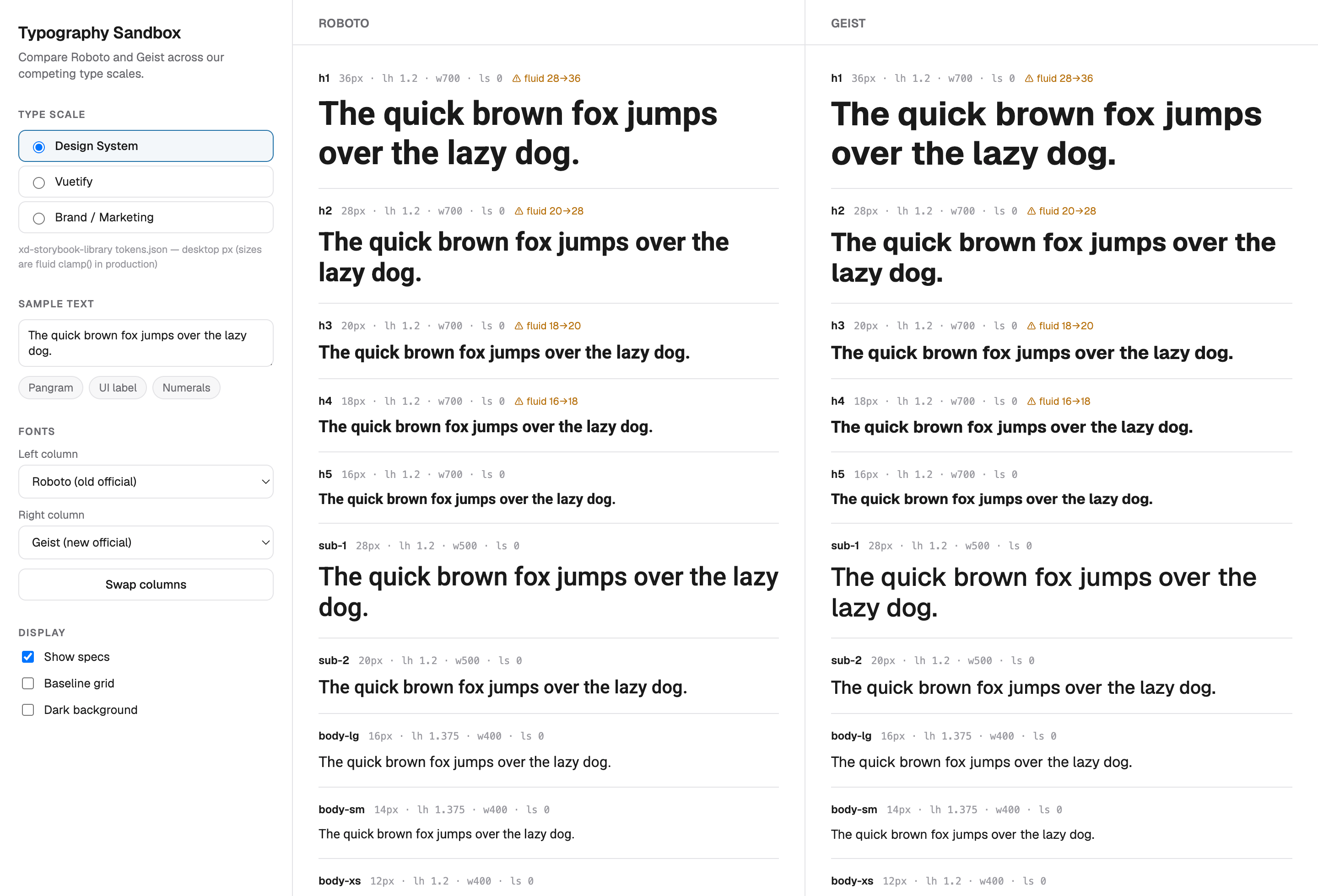
At the same time, Zoro is transitioning its web font from Roboto to Geist. So I built a typography sandbox that makes the whole mess visible at once: pick any of the three typescales, compare Roboto and Geist side by side across the full scale, and read the specs inline for every level. It's still in active use by the tiger team. The goal is one unified typescale that every team uses. We're getting there.
Why it's still called KIT
Zoro's first logo was a fox, and a baby fox is called a kit. The name was a throwback to the beginning of the company. But it's also literal now: what we're building is a design kit. The Figma components, the coded components, the governed templates, and every usage rule that goes with them. We're calling it the Kit.
Technically, the name still works. So it stays.
What this case study is really about
This isn't the flashiest work in the portfolio. There's no A/B test readout and no revenue number. It's also not finished: the tiger team's 90 days are still running, and I'll update this page when they're done.
It's here because most design system stories skip the part where the first two attempts fail. Ours failed for knowable reasons: a team with no mandate, process standing in for progress, work invisible to the people who fund work. The third attempt exists because those failures were diagnosed honestly, and because the foundation for it had already been built by two people who weren't waiting for permission.
I was added to KIT because I bias toward action. I was chosen for the tiger team for the same reason. The temperament that forces a vote on badge colors is the same one that audits 772 components in a week. Neither one waits for a gantt chart.