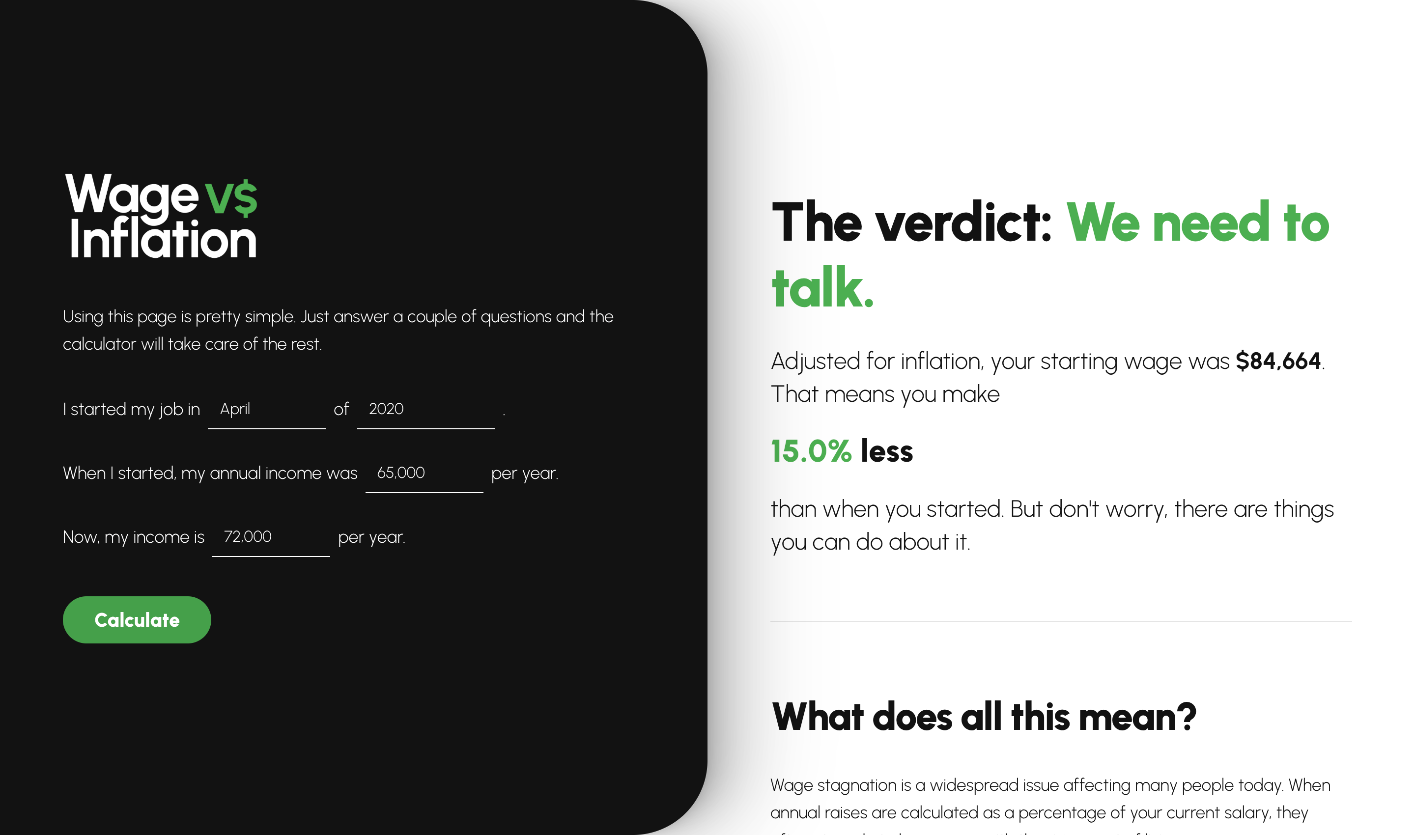
In 2023, inflation was at an all-time high. Everyone had gotten raises, and everyone still felt worse off. The news talks about inflation one month at a time and never about how it compounds. You hear 4%, you got a 3% raise, so why does everything feel worse? Because since 2020, prices were up more than 25% while wages grew around 10%. I used to teach Econ. I wasn't going to bore anyone with the explanation. But I could show them.
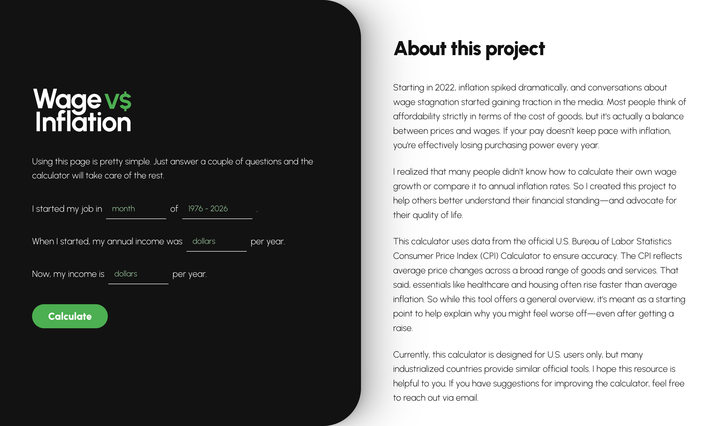
Enter what you made in 2020, or any month and year. Enter what you make now. The Bureau of Labor Statistics data does the rest, and you get one clear number: adjusted for inflation, you either make more than when you started, or you make less. Most people have never seen that number. An annual raise feels like enough, but more often than not, even with promotions, the longer you stay somewhere the less you make in real terms. The goal was a visual you could bring to a raise conversation. I've been here five years, I got promoted, and I make less than when I started. What can we do about that?
I designed it in 2023 and couldn't build it. The UI was no problem. The BLS API beat me every single time, and the documentation wasn't written for people like me. Friends were busy. I shelved it as another good idea I didn't know how to build.
In March 2025, inflation was back in the news, and my engineering friends had been talking about Cursor. I asked if they thought it could fix my project. "All you can do is try." I had a cold, rainy work trip to Chicago and a hotel night with nothing to do. I linked the BLS documentation in the Cursor chat and it got the API working on the first try. I spent more time learning how to prompt than building the site. It was live before the night was over.
That was the night everything changed. My ideas stopped being "what if" and became "let's try." Everything else on this page compounds from that hotel room.