Everyone knew. Nobody knew how.
At least once a week, someone at Zoro said "this is why we need a design system."
Zoro had tried twice before I was involved. The first attempt came while Zoro was still close to its startup days, when there was too much else going on and the designers were moved to other work. The second was a product team set up to build a fully custom, accessible design system, but not much came out of it, and that team was shut down too. Engineering's view at the time was, why build components when Vuetify already has them?
So Zoro ran on Vuetify for years. Vuetify is fine, but it isn't a design system, and what built up instead was inconsistency and accessibility problems: badges that looked different depending on who designed them, link styles that varied by team, and three competing typescales. That wasn't because anyone made bad decisions. It was because there was never a system to make a decision once and apply it everywhere.
Attempt three: KIT
In October 2025, a group of five designers called KIT was formed to try again. It wasn't really a team, just five people fitting design system work around their real jobs.
Three months in, nothing had shipped. Designers could submit real questions through an intake form, like "What are the rules for badges on product cards?", and the questions came in, but answers didn't go out.
In January 2026, a seat opened, and my manager added me with one request: help them move faster.
The badge question came up in my first meeting. A week later we met to discuss badges and spent the hour discussing how to discuss badges, and it ended with a plan for another meeting and a board to collect every place we might ever use a badge.
So I said no. It's a badge, and we have five colors. Everyone in the room was a lead with at least eight years of experience, so I pushed for a vote, and we decided that day. Two weeks later the component was redesigned, documented, and out.
It happened a few more times. A question would start growing a process around itself, I'd push for a vote, and we'd decide, because experienced people don't need a Gantt chart to make a judgment call. One good component shipped quickly beats one perfect component in six months. But a few forced votes couldn't fix the format, and five part-time people with no mandate weren't going to build a design system.


Three efforts became one
Around the same time, three things were happening at once.
KIT was moving slowly. Another designer was auditing our Figma library against the production code, to find where the two had drifted apart. And I had just demoed the Storybook library: every component from our Figma library, coded on the exact production stack.
Our new design director saw all three and combined them into one official program. KIT was dissolved, but the people stayed, and everyone got 20% of their week for design system work and 90 days to ship an MVP with documentation.
For a while it was still called KIT, and then the tiger team, before it ended up as the Zoro Design System. I played a major role in the early stages.
Built while they were still talking
Early on, one meeting was about needing a design system site, and the conversation was about tickets and who would do the work.
I knew from experience it wouldn't take long to just do it. So while the meeting kept going, I gave Cursor our brand guidelines, our colors and fonts, and a few design system sites from other companies that we liked. Then I wrote one long prompt telling it to build the shell, fill in the foundations from what I gave it, and leave the rest empty for the team.
It ran for about 20 minutes, and by the end of the meeting the site was up and hosted, and everyone had access to the repository to start adding to it.
That site became the documentation for the whole system. The team has changed the foundations and added colors since, and that was the point, because it was a place to put decisions as we made them.
Week one: 772 components
The first question was the right one: what do we even have?
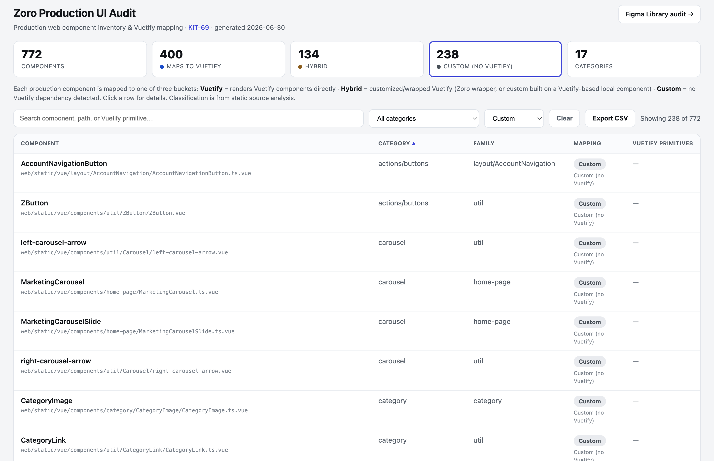
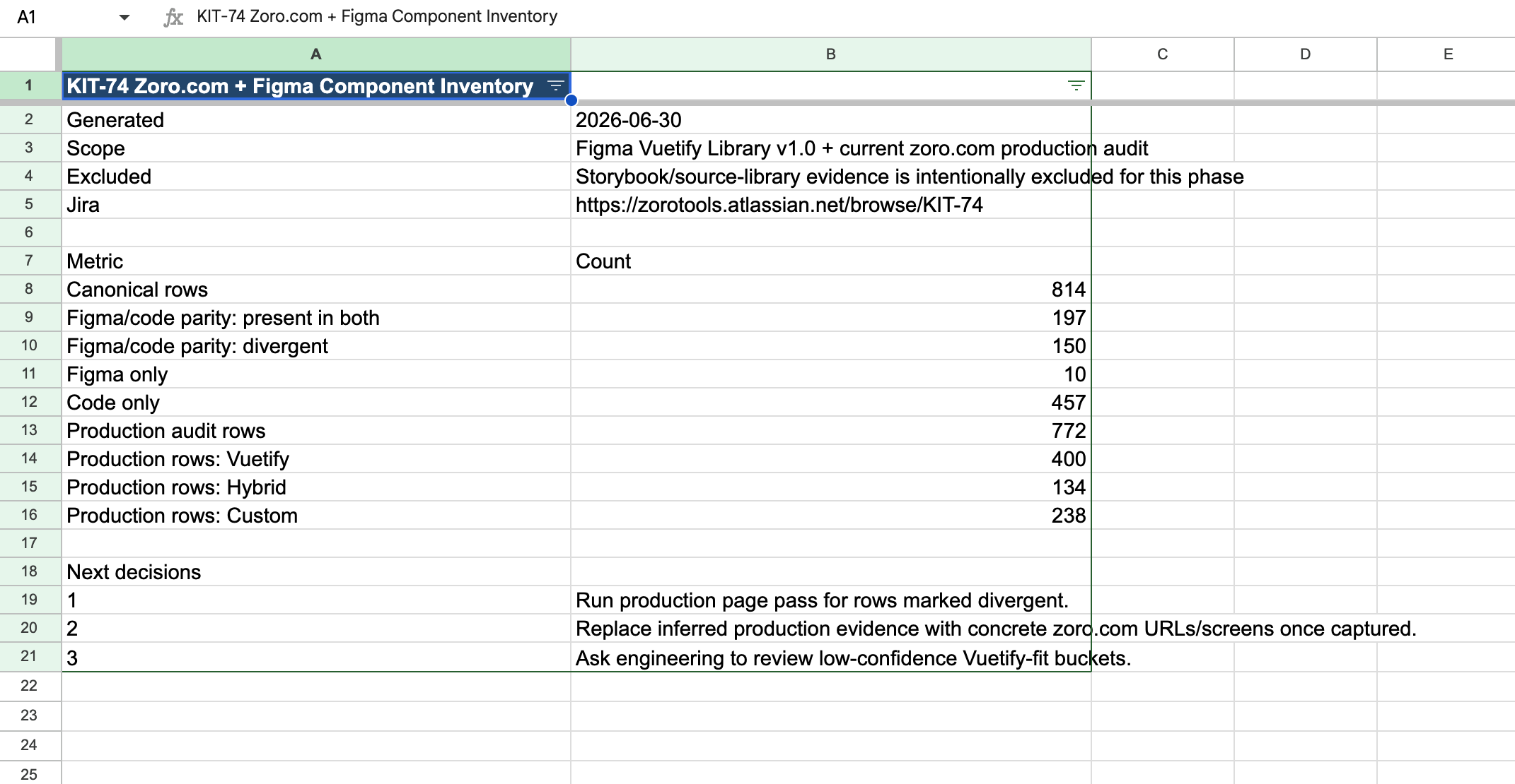
In the first week, I audited every component in our Figma library and every component on the live site, and built a dashboard to hold it all. I had Cursor scan the full production codebase and found 772 components, including 156 duplicates. 400 map directly to Vuetify, 134 are hybrids built around it, and 238 are fully custom.
Then came the bigger number. 457 components existed only in code, which meant designers had been working from a Figma library that didn't cover more than half of what customers actually see.
The audit went further than counting. I flagged components that weren't built properly, so the teams that owned them could fix them, and every place a value was hard-coded instead of using a variable. That way, when a color changes or the new typescale goes live, nothing gets left behind.
Leadership had a standing complaint that our site breaks the grid constantly, and he wasn't wrong. So I built two Chrome plugins for the audit. One lays the grid over any live page and highlights whatever falls outside it. The other pulls an element from the live page and compares it with its Figma component, since Figma is the source of truth. Both turned hunting for outliers by eye into a quick check anyone could repeat.
Then the method spread. I walked another designer through cloning the codebase and having Cursor check every font size against our typescales, and showed her how to add the results to the dashboard. Others added accessibility audits and CMS audits the same way, and by the end of the week the whole team was auditing at a scale that used to be impossible.
One typescale
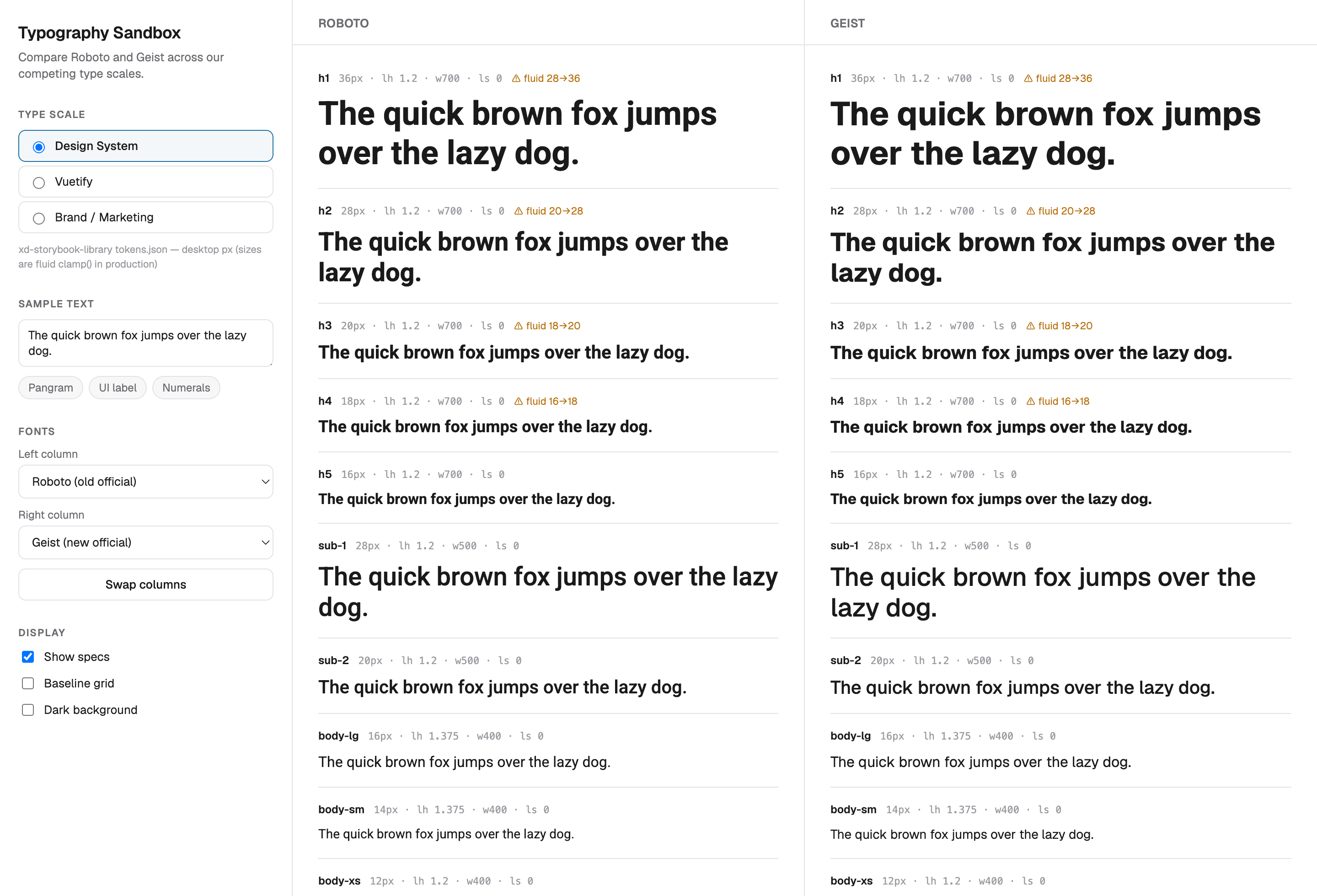
Zoro was running three typescales at once. The design system had one, Vuetify had its own, which engineers reached for when building from our designs, and Brand had a third. Two headings of the same level on the same page could be different sizes.
At the same time, we agreed to change the site's font from Roboto to Geist, the font in our brand guidelines. Changing the font and merging three typescales at once could break layouts across the whole site, and we needed to see it before asking engineering for any of their time.
I worked with another designer to build one unified typescale, and I built a sandbox that shows all three old scales side by side, in both fonts, with the specs inline.
Then I tested it on the real site. I asked for access to the production repository and got it, read-only, because of the work I'd already done. I cloned the whole site locally, swapped in the new font tokens and typescale, and looked at real pages instead of mockups, so we saw the actual site in the new type.
Ninety days, two to spare
The deadline was September 30. The early work went slowly, at 20% of the week, and then everything happened at once from July. The MVP shipped two days early, which, given everything in it, felt impossible.
The other 80% of the week was still product work, and that meant prototypes for testing, built on the Storybook library. So every design system decision also had to land in the library, and Aaron and I kept the two in step the whole way.
What we shipped in Q3 won the budget for an engineer, hired in October, and that's when it stopped being a tiger team and became a real program. The engineer is building components and merging them into production, and the team is down to a couple of dedicated designers.
I'm not one of them, because I moved on to lead the loyalty program. But I built the starting points: the documentation site, the audit dashboard, the full audit, and the typescale testing on the real site. Zoro needed four attempts to get a design system, and the fourth one worked because we built things instead of talking about building them.