Print Journalism Layouts Should Make a Comeback
5 minute read / by Sam Daugherty / May 18th, 2025
Share
There's something wonderful about having a fixed size for your canvas and being able to play around with layouts that don't translate well to responsive design. It's one of the things I loved about working in print back in the day. You could be so creative with how you lay out images and text, and how they interact with each other. Typography was as much a part of the art as the text. We don't see it much in modern web design anymore, and I think that's sad. But I also think we simply are not being creative enough.
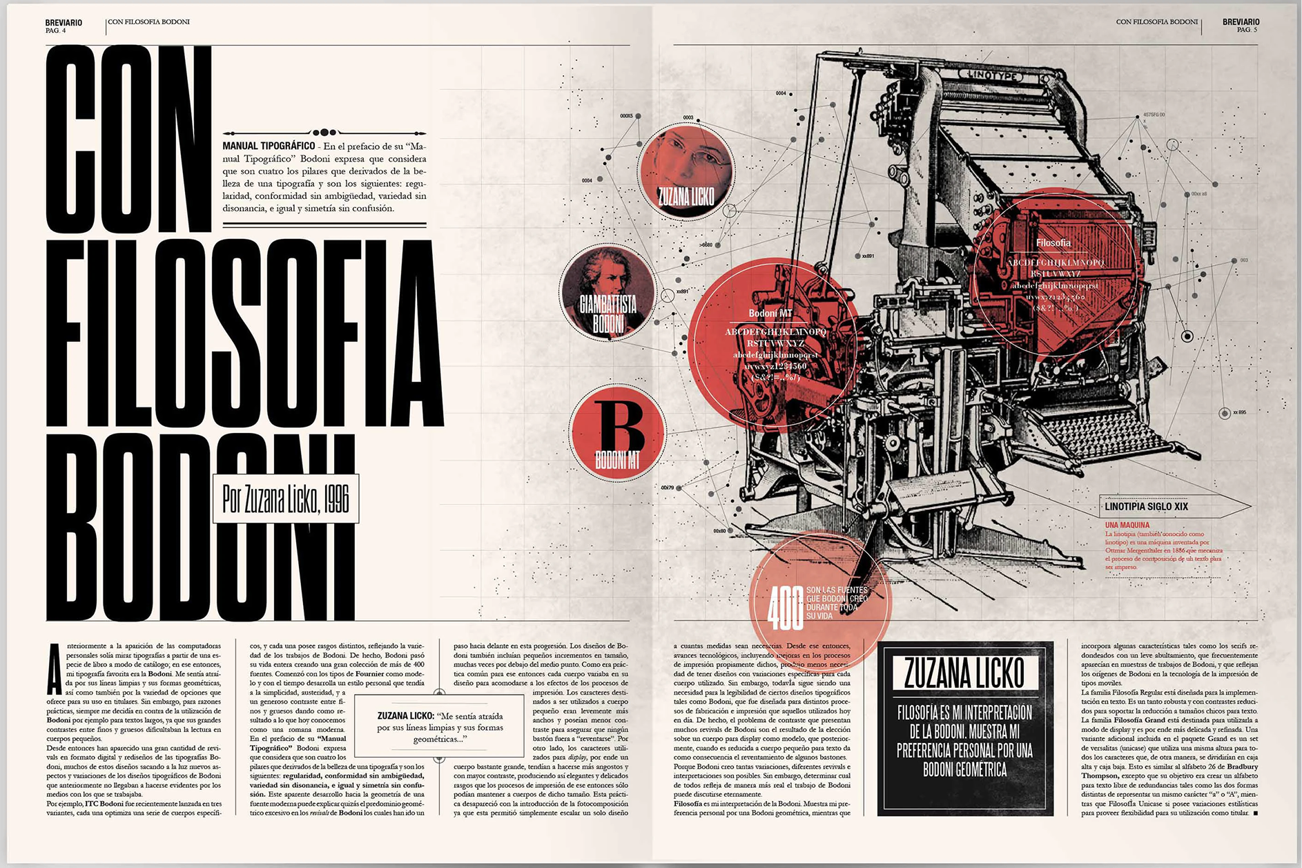
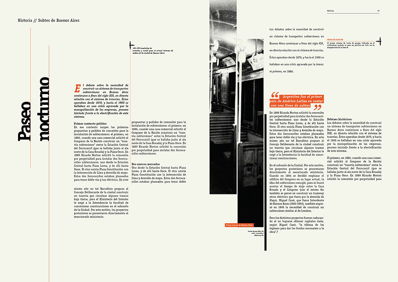
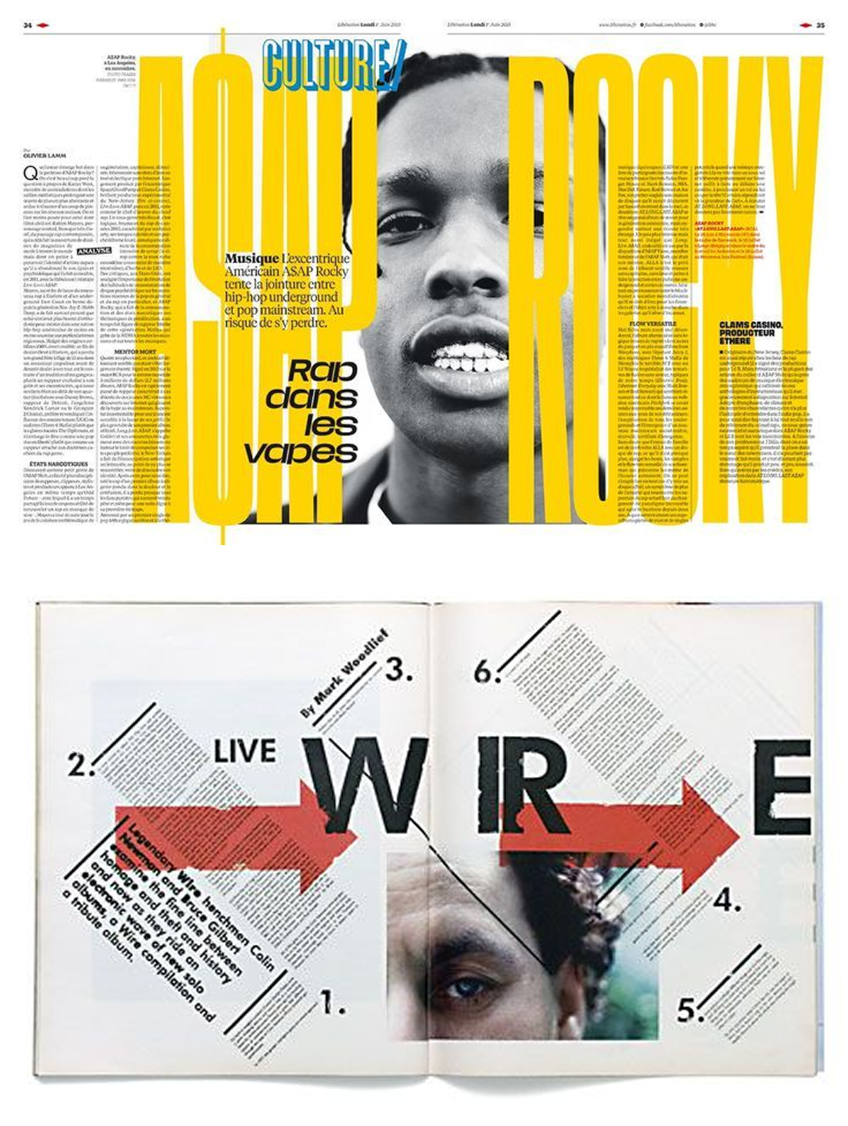
Photo by Boris Vargas on Behance
This is the image that originally inspired my design for this website. This is a great example of amazing print layout and typography. It's the kind of design that dominated the publication world, and then slowly disappeared as we all chased other trends.
That's why I'm declaring, boldly with my whole chest, that it's time to draw inspiration from print journalism. Not the modern kind, no. The classic kind. The kind that was studied in Graphic Design courses at universities. The kind that inspired people to become designers in the first place.
We Can't All Be Apple
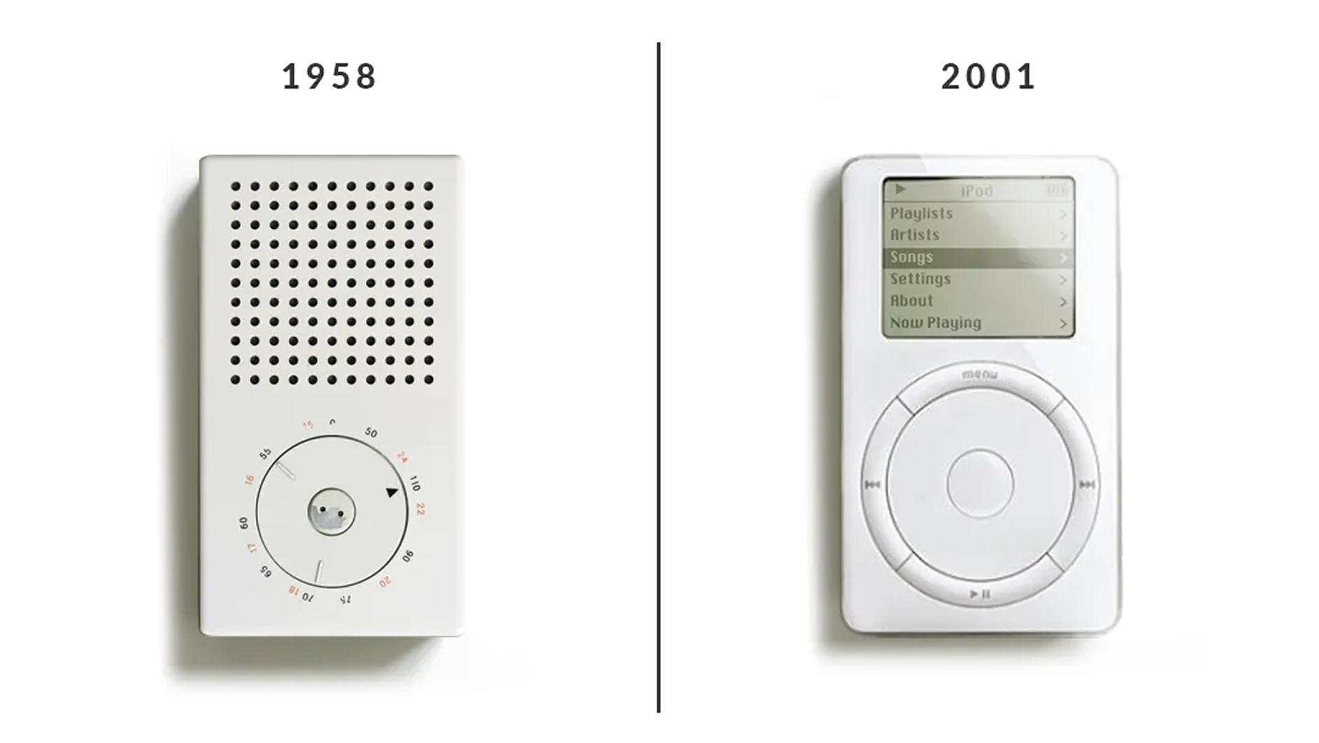
I place some of the blame on Apple for this. They came onto the scene with a form of extreme minimalism that was unheard of at the time. The designs drew inspiration from Dieter Rams' famous industrial designs, and their product landing pages were just as sparse with content in a way that was confident and daring. And for Apple, it worked. It worked because, at the time, it was different.
That set the trend for the next decade-plus of everyone trying to be minimal. I remember in 2008, after Obama won the Presidency, design publications discussed his "modern minimalism" on his website and press pieces. They were simple. Clean. They compared word counts. They used this as an example of how the Democratic Party was modern and the Republican Party was old and outdated.
That's what we needed. We needed calm. We needed less. We were forced to think minimally.
I'm not here to write about politics, but 2008 was kind of the dawning age of this trend becoming mainstream, so it feels relevant and timely. It was a time when we were giving up heavy maximalism and Flash websites to chase a more modern feeling. A time of economic collapse, forcing all of us to accept less in every aspect of our lives. A far more minimal time, because that's what we needed. We needed calm. We needed less. We were forced to think minimally.
Hindered by Technology
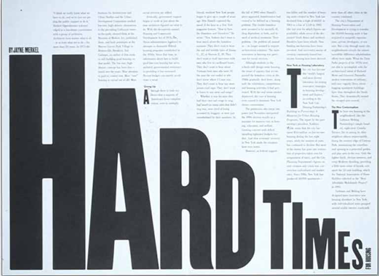
One of the most noticeable aspects of print journalism is the column. The grid makes up nearly everything and the entire layout was based around it. But columns weren't a thing during the minimalism trend, so it makes sense we'd abandon them for web. Hell, CSS was barely a thing, let alone CSS3.
But we've had access to columns in web design since March 2017, when the majority of browsers began supporting it. But it never really made a comeback. Despite a column being a natural extension of the grid, which modern CSS is also built around. So why aren't we using them? Screens are only becoming larger, and responsive design still allows us to rearrange things for phones as needed!
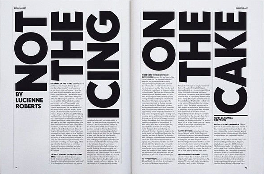
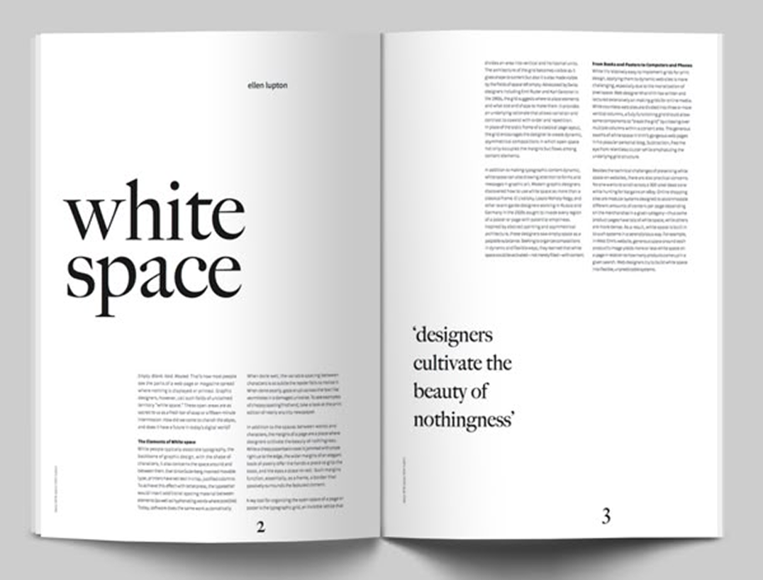
Even current trends, such as "letting the content breathe" and excessive whitespace, aren't new, and were widely used in print publications when we wanted to convey a certain emotion. We used design to drive emotion, good or bad. This image demonstrates how white space can be used to create a sense of calm.
But, what if we don't want to convey calm? What if we want to convey energy? Or chaos? What if the story we're trying to tell isn't serene or happy? What if it's daring and stands tall? We can use the layout to create those emotions, too.
We are a visual people. We don't just see the words; we take in the entire screen in our visual field, and everything we see drives how we feel when we view the piece. Our layout isn't about displaying content; it's about giving the viewer a sense of how they should feel when they consume our content. And, for whatever reason, we've opted for “I want them to feel nothing” as the bread and butter of modern design.
Make Them Feel Something
All I'm saying is, I think, as designers, we've lost our way a bit. We're being too safe because that's the world we were brought up in as creatives. Even in the world of print journalism and publication, the primary factor of design is the web. We create for the web, for the digital version of the article, and then we allow that to drive how it appears in print. I hate it so much! We used to be bold (shakes fist at cloud).
Anyway. One of the skills I used to include on my resume was Typography. It is a skill. I still believe that. It's an art form and, as a graffiti artist, one I hold dear to my heart. But I removed it ages ago, because it never matched any keywords in job descriptions. We no longer see it as a need. But I think it still is.
And, more importantly, I believe the modern frameworks and capabilities of browsers have opened up new avenues for us to flex our creativity. No more boring Bootstrap layouts. Fuck that. It had a good run, and it's time for something fresh.
No more boring Bootstrap layouts. Fuck that. It had a good run, and it's time for something fresh.
We have columns we can use, and we have control over them using flex. We have responsive typography at our fingertips using clamp(), and we have AI that can help us write the code if we can't figure out how to do it ourselves with tools like Cursor or v0. In other words, nothing is stopping us except ourselves.
Don't be boring. Stop. You're better than that. You deserve better than that. And we all deserve to see how creative you can be.