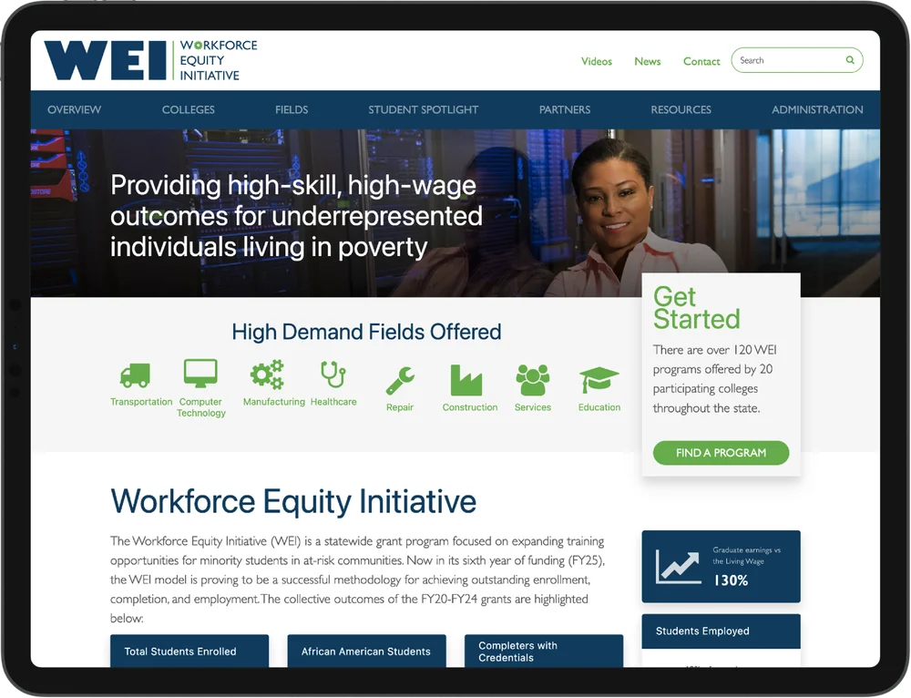
Workforce Equity Initiative
Helping 15,000 people find their next career
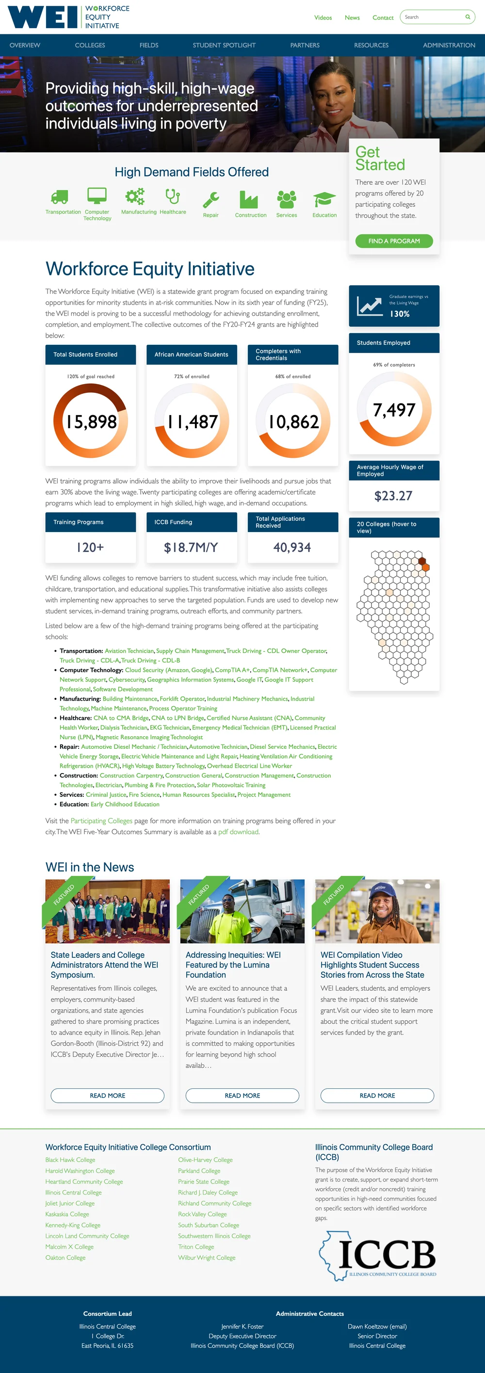
I was approached by the Illinois Community College Board (ICCB) with a challenge: Build a digital experience that clearly communicates the impact of their Workforce Equity Initiative (WEI)—a program designed to help thousands of people across Illinois train for better-paying, in-demand careers. The ask was to tell a compelling story, backed by complex data, in a format simple enough for busy state legislators to absorb quickly. And we had a very real deadline: a vote on continued state funding.

A Quick Update
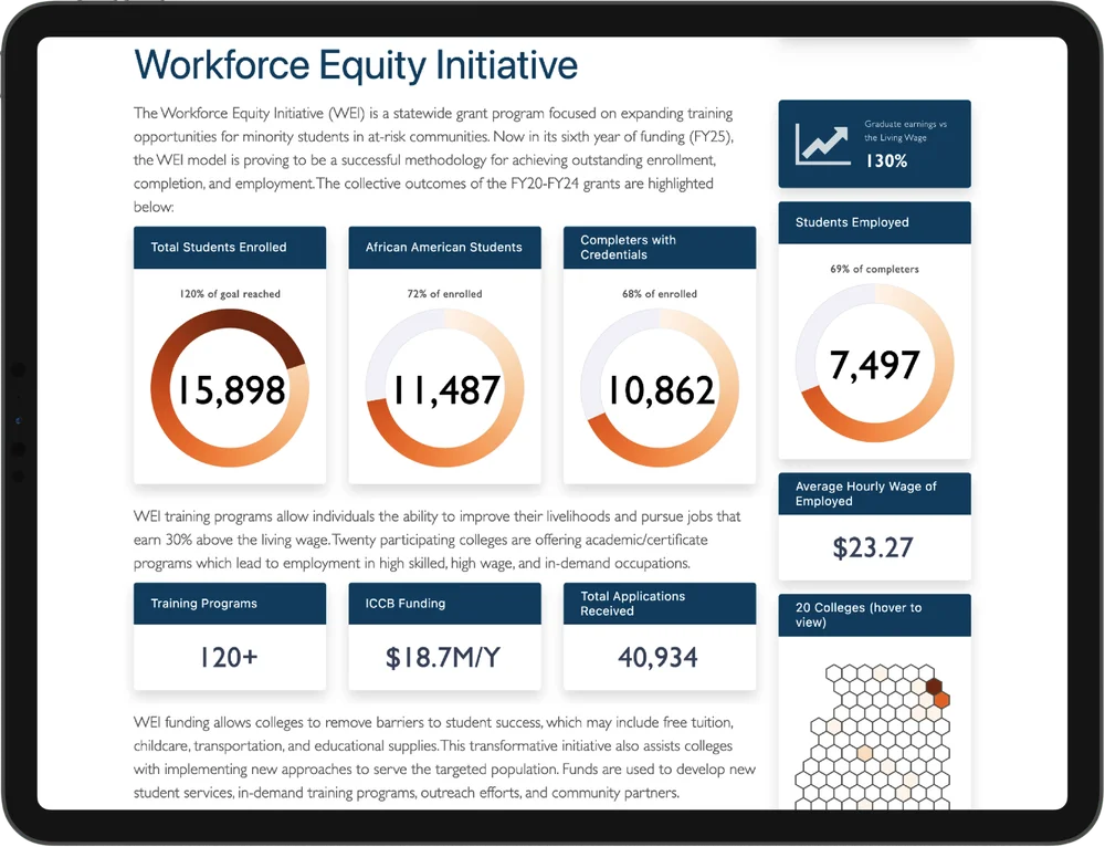
FY2024 marked the end of our initial five-year funding round. Thanks to the original project's success, we had a much stronger position going into our next pitch to the State. But with millions of dollars on the line, we couldn't leave it to chance. We refined the site, tailored the story, and secured continued funding for FY2025 that will support over 15,000 students statewide and expand the program to 20+ community colleges. This case study now reflects those new outcomes.
This wasn't just a project; it was a story about what happens when design meets community need. Over the course of five years, we not only built the experience—we returned to it, improved it, and helped secure the future of the program for thousands more.
In the end, we achieved exactly what we set out to do:
Notable Program Outcomes
- • Secured $18M+ in new grant funding
- • Over 15,000 students enrolled statewide
- • Achieved 120% of the program's original five-year goals
- • Additional Funding secured for FY2025
This project mattered. It was a major win for our team, but more importantly, it created opportunity for thousands of students in low-income communities across Illinois. And it all started with showing the right story, at the right time, in the right way.
Every once in a while, a project comes along that feels like a perfect intersection of your passions, past experience, and present skills. This was one of those.
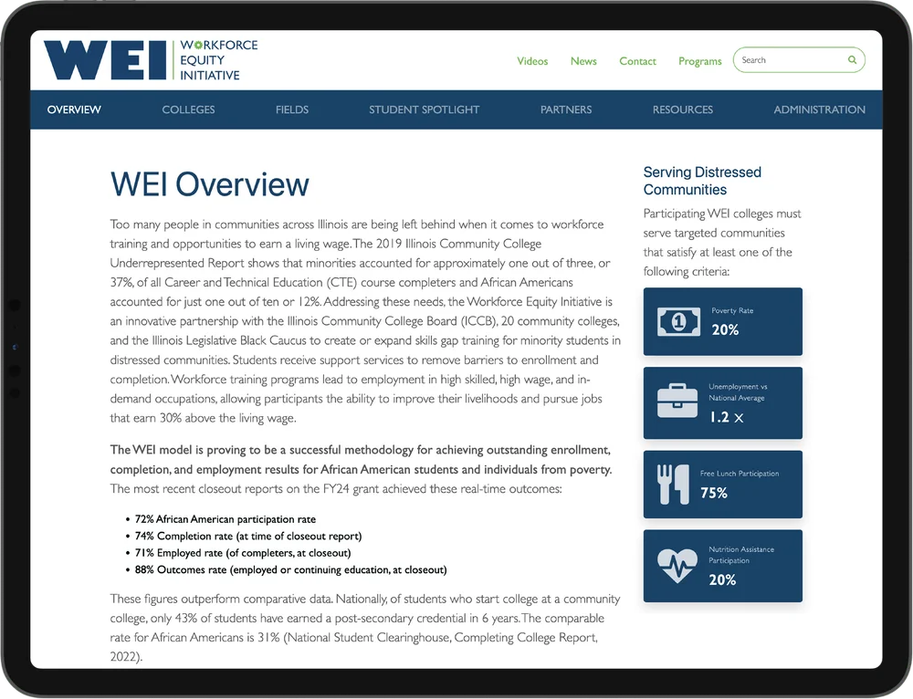
The Illinois Community College Board oversees 48 public community colleges across the state. Their Workforce Equity Initiative is designed to provide short-term training programs that help participants earn a living wage. But in order to keep this program alive—and scale it—they needed more than just data. They needed to show its impact, clearly and convincingly.
Our audience was twofold: Members of the Illinois House of Representatives, who needed a quick, clear view of the program's effectiveness. And taxpayers and prospective students, who needed transparency, clarity, and access to the data. The stakes were high. The ongoing success of this project would impact over 10,000 students in underserved zip codes over the next five years. We had one shot to get it right.
The first thing we had to do was get a handle on the data—and there was a lot of it. With 15 initial colleges and thousands of students across dozens of training programs, it was easy to get lost in the numbers. We needed to distill it down to the most important insights, and make it easy to understand.
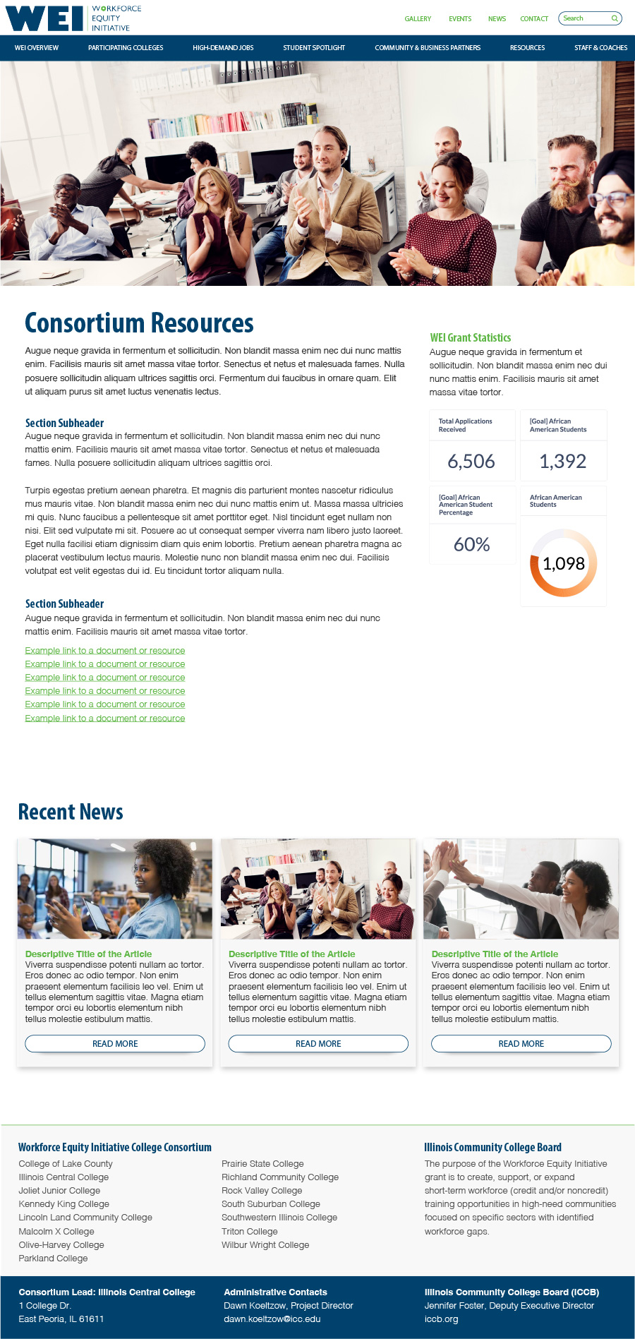
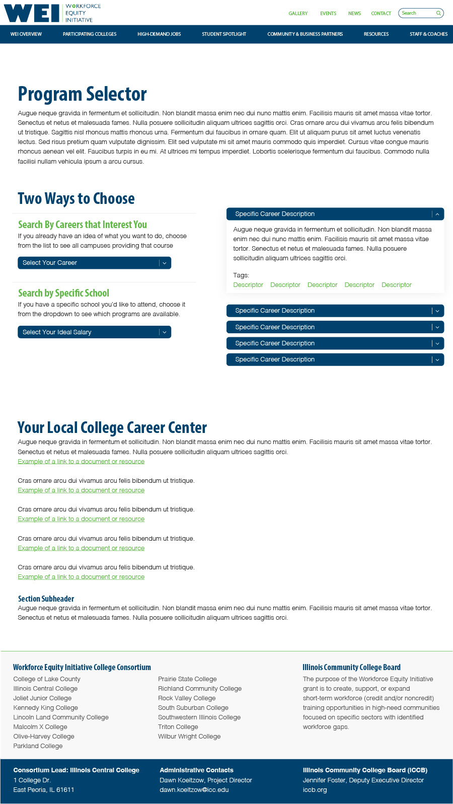
So we started by mapping everything out. What did we have? What was useful? What could be trimmed? Then we reframed it through the lens of the actual audience of state representatives who had about five minutes to make a decision about funding. And also for constituents who deserved to see how their money was being used. We worked with a small group of user testers to finalize the Information Architecture and Content Strategy for each page.
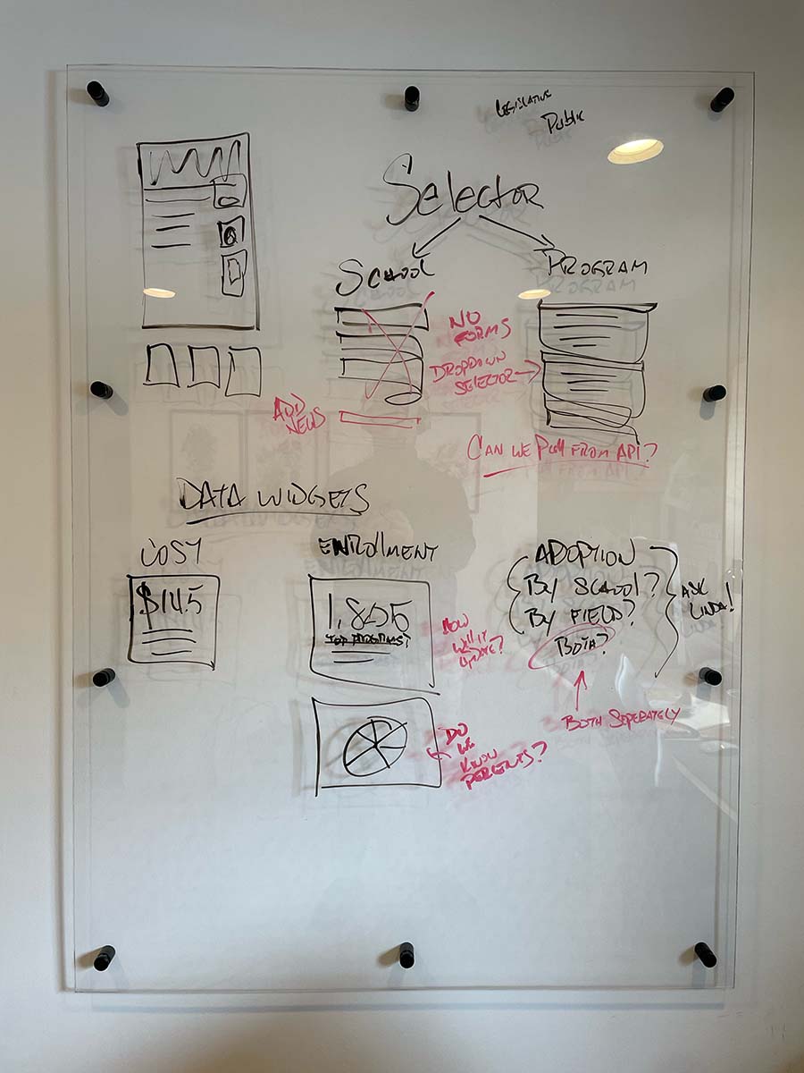

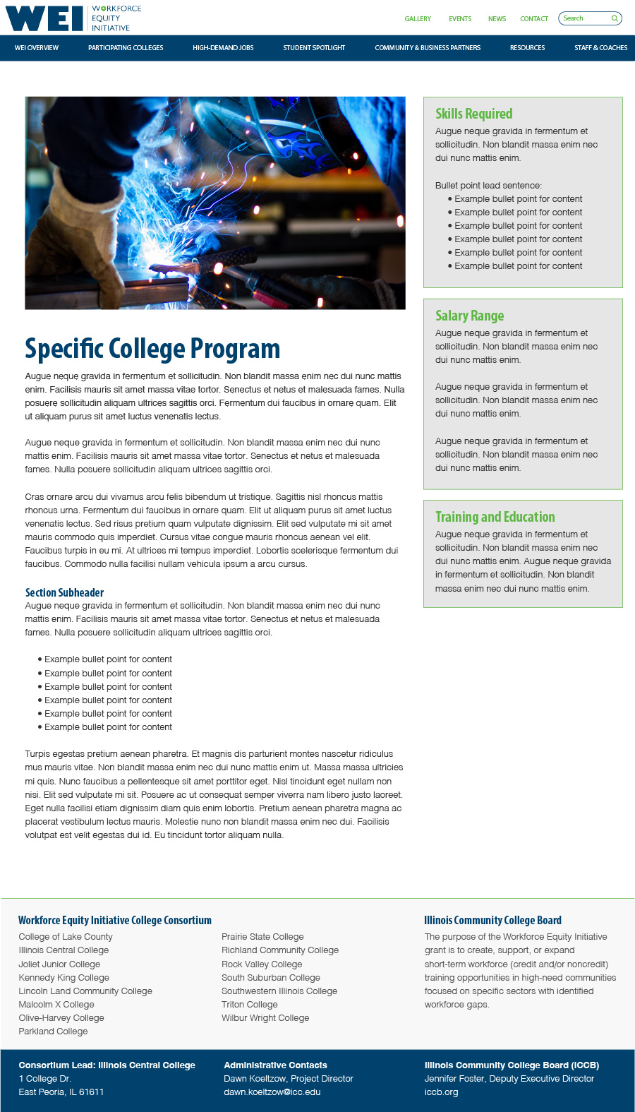
With the content in place, we moved into layout and hierarchy. The challenge here wasn't "what do we show?" It was, "how do we show this in a way that doesn't overwhelm or confuse?" This was a strictly informative experience—no calls to action, no marketing fluff—so the data had to lead.
We identified core pages and content types, then ran a rapid tree test and user testing to help validate the information architecture and user journeys. From there, we moved into low-fidelity sketching and wireframes, carefully stripping away anything unnecessary, and ensuring secondary content was accessible without being intrusive.

Calling this an MVP feels a little misleading. It was technically our first version, yes; but there was no room for iteration. We had a hard launch date and a live legislative session on the calendar. This had to be done right, and it had to be done on time.
We collaborated directly with the 15 colleges involved in the initial funding round, finalizing content and formatting everything into clean, consistent layouts. I handled the coded templates, and colleges populated them with their respective data.
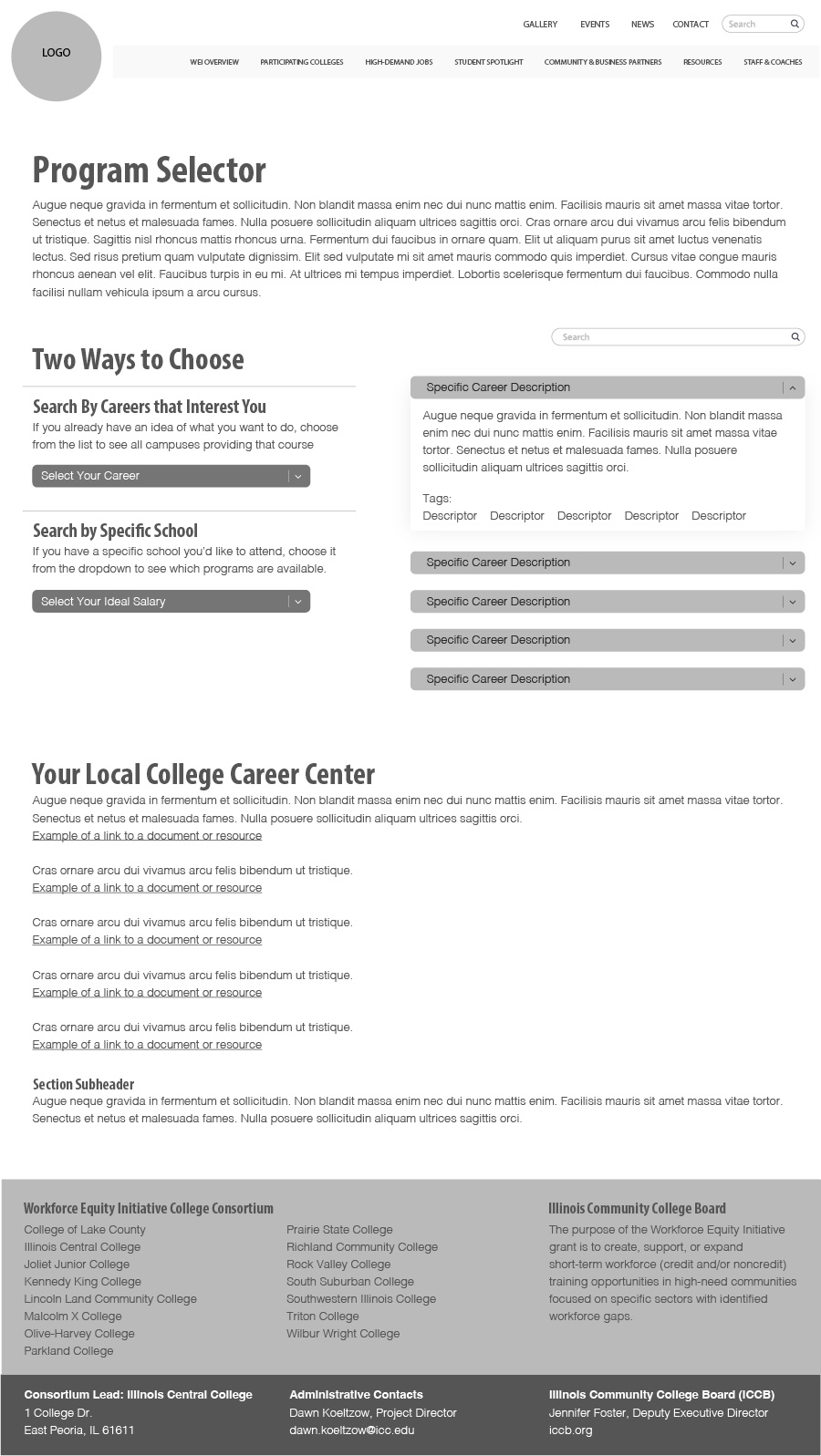
We also built in a few late-stage features—including an interactive field-of-study tool for students and transparency tools for taxpayers—things that weren't originally scoped, but ultimately made the experience far stronger.
This was one of the most meaningful projects of my career. Not just because of the scale or the outcome—but because of the people. My local community college, which led this initiative, is in my neighborhood. I've seen firsthand how this program has changed lives. Friends, neighbors, people I grew up with—they've gained real skills and real careers because of this work.
And if this project taught me anything, it's that design matters. It can tell stories that move policy. It can shift perception. It can secure funding and shape futures. In our industry, it's easy to feel like we're just pushing pixels or meeting deadlines. But sometimes—when everything aligns—design really can make a difference. And this time, it did. You can view the full site here.